Make bold garden choices
Published 12:00 am Tuesday, May 20, 2014
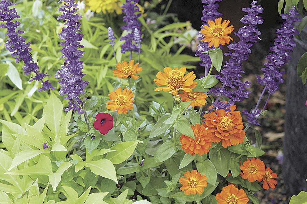
- Norman Winter / MCT / Submitted photoOrange Zinnia stands out among other flowers in this grouping.
During the past eight weeks I have had the pleasure of sharing my love of gardening through educational and social venues.
I have written about color before, but the last group I was with reminded me how personal color is. As I looked around the room, I saw notebooks in numerous colors. Did the bold colors reflect an eclectic garden, or did pastels suggest the preference for an English cottage garden? It’s interesting that even seemingly insignificant purchases such as a notebook are influenced by our subconscious color preference. By the end of the day, my notebook/clothing/garden color theories were confirmed.
Now flip the coin and you get what is probably a more common scenario. A gardener goes to a nursery or garden center and can’t make a decision on which color to choose. They all look great and wonderful, perhaps because we are still in recovery from being somewhat color-deprived through the winter. Or maybe, like me, you are a Gemini and still don’t know what you want to be when you grow up, let alone what colors to choose for your garden.
In the marketplace, the pastels look so appealing that I decide I need to give them another try. After I get them home and plant them, I find I ignore the pastel-colored blooms, and consequently they struggle to try to turn my head.
They don’t give me the go-to feeling of, “How ya doing? You make me smile.” The moral of the story gets down to knowing what colors really make you happy.
Pastels are especially beneficial in making a small garden look larger. They also have the ability to calm the spirit at the end of a busy workday. The combination of pink hues of two or more plant varieties with different flower shapes and foliage can be very striking. Combining an echinacea in a cool pink with a summer phlox in a closely related hue would be a pleasing sight. Definitely out of the normal pastel combination would be a light peach combined with a violet with just a dab of red to catch your eye.
Dealing with shade is a problem I didn’t realize so many homeowners encounter. Relaxing under the trees’ cool shade sounds wonderful on a hot summer day, and lucky are those who have it. Gardening in that same shade can be a problem, but with the more dense construction in the newer developments, you may not have other options.
The selection of flowering plants for shade is more limited and requires more careful planting to minimize tree root disturbance and damage. Ajuga, commonly called bugleweed, is a perennial that is happy in the shadiest section of my rockery and under a large juniper tree. Bleeding heart, Virginia bluebell, forget-me-not and lily of the valley are additional perennials to look for. My favorite shade-loving perennials are the varieties of perennial geranium commonly known as cranesbills. Blooms are delicate and rise above the leaves. Leaves show color in fall.
Hostas should also be considered. I recently read that the more textured the leaf, the less appealing the plant is to deer. A mixture of foliage plants with their different shades of green, variegated varieties and texture helps to liven a shady corner. Many of the new Heuchera are being used mainly for foliage attraction rather than flower interest. Foliage with a white variegation or a white flower helps to brighten a shady area. Also have an open eye for all the varieties of the annual coleus.
If you are looking for eye-catching color combinations for sunny gardens, you may want to consider a choice from the following.
• Bold: A key color: yellow. Use yellow-green variegated foliage and additional yellow-orange or bright peachy blooms to emphasize yellow blooms. This would be an analogous color scheme, meaning that the colors are adjacent to one another on the color wheel.
• Bolder: A split complementary scheme on the color wheel includes a blue-green, red and yellow-green. Red provides the key-color, with cool shades of blue-green and yellow-green (chartreuse) to keep it in check. Mixing in light neutrals, such as white, silver or gray increases the contrast even more. I now know how I am going to revamp a bed in close proximity to a blue spruce. The blue spruce provides the blue-green; I’ll move some of the low-growing silver artemesia and shop for some red perennial and a shot of chartreuse foliage. Warm colors appear bigger and closer than cool colors, and I will need to limit the use of red in order to keep the emphasis on the beauty of the blue spruce.
• Boldest: A complementary color scheme would be the boldest and most intense, as those are the colors completely opposite on the color wheel; orange and blue would be an example. Take a second look at the paintings of Pablo Picasso, who loved to use complements in his bold paintings. Your color palette doesn’t have to be limited to plants: A piece of garden art, a funky bowl or a gazing globe might provide the pop of color you need to brighten a spot.
Color inspiration doesn’t necessarily have to come from garden publications. Look through magazines and especially the ads — big bucks have been paid to grab your attention.
This is the year I am going to shop with a plan and not surrender to impulsive purchases (well maybe just a few). For me, going to a nursery is like going grocery shopping when hungry — I want everything in sight.
— Reporter: douville@bendbroadband.com


Best of the Best of Bend 2025

-
-
-