Colors of the Year: Pantone serves up a double dose of sugar
Published 12:00 am Saturday, December 12, 2015
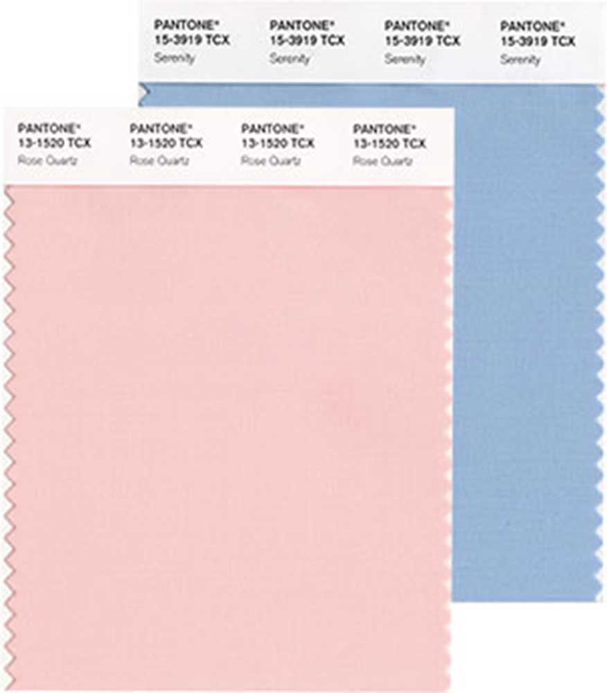
- Pantone / Submitted photo Tribune News ServicePantone chose Rose Quartz, left, and Serenity for its 2016 Colors of the Year. This is the first time two colors were picked.
A double serving of his-and-hers cotton candy. That’s one way to describe this year’s much-anticipated Color of the Year pick from the Pantone Color Institute.
For the first time, the industry color authority chose not one, but two colors — both as soft and sweet as a nursery: palest pink and baby blue, aka Rose Quartz and Serenity.
It’s all about the blend, declared Pantone in announcing the pick. Choosing two hues with gender symbolism reflects the gender blur and fluidity that is taking place in fashion and the culture at large.
“Wow! At first blush — no pun intended — this is a bit of a shocker,” said Keri Olson of KOR Interior Design, St. Paul, Minnesota, reacting to the newly anointed duo. “But taking a deeper look, it’s telling.” Both are peaceful colors, she noted. “I think that is something everyone would like a little more of, everywhere.”
Peace was, indeed, on Pantone’s mind, according to executive director Leatrice Eiseman in a release announcing the pick. “Joined together, Rose Quartz and Serenity demonstrate an inherent balance between a warmer embracing rose tone and the cooler tranquil blue, reflecting connection and wellness, as well as a soothing sense of order and peace.”
Today’s consumers seek “mindfulness and well-being as an antidote to modern-day stresses,” Pantone noted. Baby-soft colors provide a welcome psychological security blanket.
The new color duo follows last year’s ruddy-brown Marsala, a sharp turn after several years of bright, bold colors. (Remember Radiant Orchid and Tangerine Tango?)
“In the past, the colors have been so regal and rich,” said Renae Keller, Renae Keller Interior Design, Minneapolis. “This (the new duo) is so serene. It’s a nice, calming change.”
It’s easy to picture baby pink and blue showing up on cuddly sweaters, but will these hues cross over from fashion to furniture and interior design?
They already have, according to Olson. “There was a lot of this pink at (the recent High Point Furniture Market) … so the industry is reflecting this already.”
And they’re not as saccharine as they first appear. “Both are soft subtle shades we associate with babies, yet they have dusty undertones that make them more interesting,” Olson noted.
But not too dusty. “Everybody remembers mauve from the 1980s,” Keller said. “This is definitely not mauve, which is a good thing.”
Jeralyn Mohr of St. Paul, Minnestoa-based Full Nest Interiors is pleased to see a revival of rose. “It asks us to rethink the history of the color and to use it in a fresh way,” she said. “I love it with navy and orange or Kelly Green.”
As for the blue, “it’s a bit denim for me,” she said. “But I’d have to see a swatch. If it’s more periwinkle, then I’m on board. There are so many great textiles out there, historic and modern, that have amazing color combos with periwinkle that just vibrate to the eye, like coral, mint and periwinkle. So youthful.”
Pantone is the go-to authority on color trends, but many paint companies and other industry players also make their Color of the Year picks. Usually, these choices vary widely, but this year, there seemed to be some consensus that color trends are moving to the very pale end of the spectrum. Four different paint companies chose a white or off-white as their Color of the Year.


Best of the Best of Bend 2025

-
-
-