Trail Blazers tweak pinwheel logo
Published 11:13 pm Wednesday, May 10, 2017
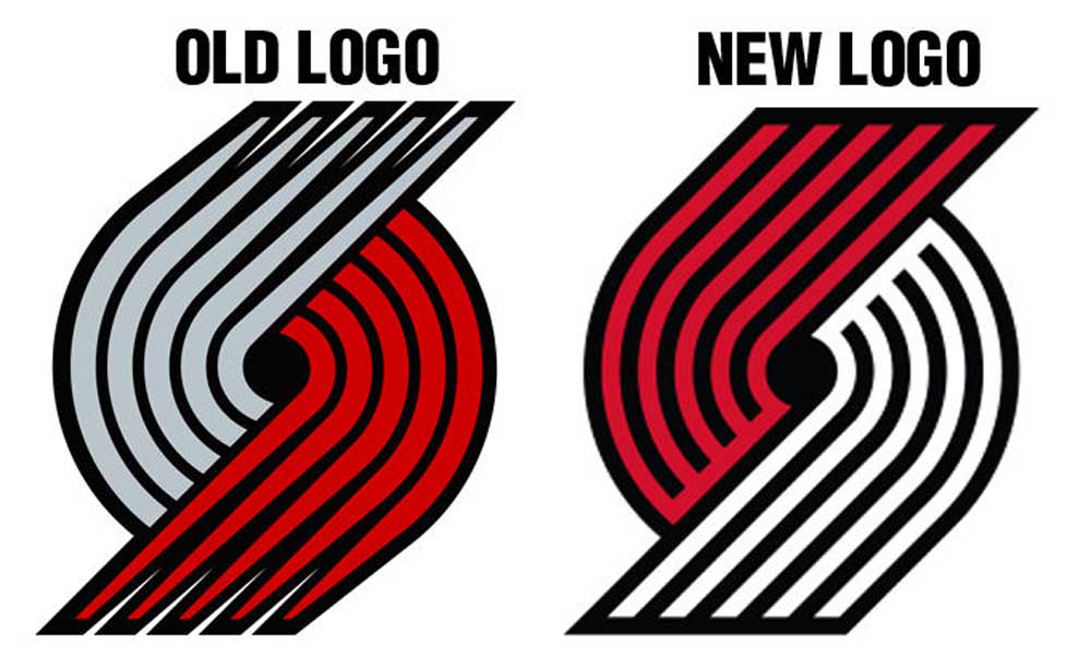
- The Blazers logos has barely changed in 50 years.
The Portland Trail Blazers announced an update to its iconic logo Monday, complete with overwrought explanations about what every line and corner of the pinwheel means.
“Ten lines represent the game of basketball: two teams of five players, coming together at center court in competition,” the Blazers’ website says of its logo. “The movement and symmetry of the lines reflect the mechanics and fluidity of the game.”
Trending
There is not much change from the logo that was last updated in 2004. The pinwheel is now red on top with white on the bottom, a change from gray on the top and red on the bottom. The lines also no longer taper at the ends, and the angle of the lines, according to the team, is “now at exactly 45 degrees representing the 45th parallel north that leads on a path to the Northwest region, our community and our hometown.”
In a press release, the team said the update coincides with Beaverton-based Nike becoming the provider of all NBA team uniforms and licensed apparel.
The team said it planned to release the updated logo around the draft lottery on May 16, but the NBA’s official store leaked the new logo Monday, prompting the release.
— Bulletin staff report
Trending
Marketplace


Enter the $5,000 Sweepstakes

-
eEdition

-

-