OSU’s new look to roll out in Bend
Published 11:57 am Tuesday, July 31, 2018
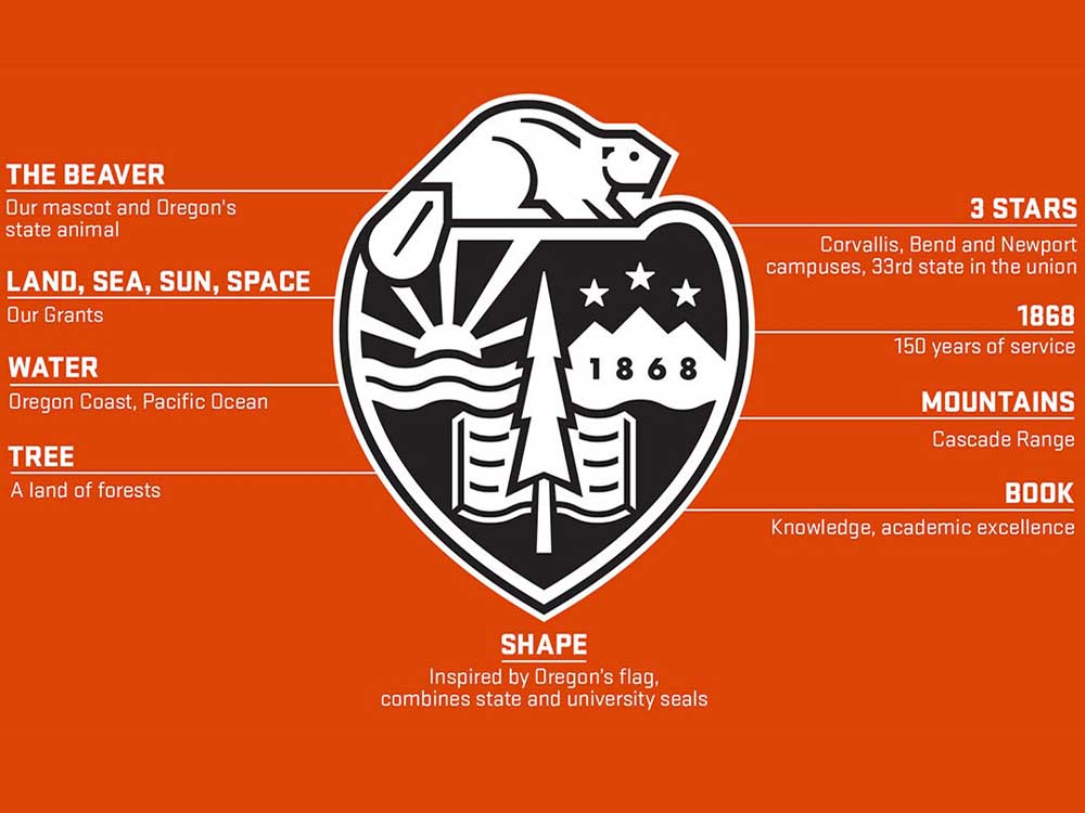
- A graphic explains the various components of the new Oregon State University seal unveiled in April 24, 2017.(Oregon State University/Submitted)
Oregon State University had an April that gave the orange and black a case of the blues.
President Ed Ray ordered a $20 million cost cut. Gov. Kate Brown’s budget slashed building funds for Bend’s Cascades campus by more than half. Tuition would go up, including a 4 percent spike for in-state students.
Undeterred, just three days after the last of the trifecta of gloomy news, OSU rolled out a plan to give the Beaver Nation brand a makeover.
Price: $500,000. Another $100,000 will go for marketing the new identity.
There is a new shield-shaped university seal, with a video to explain what all of the trees, books, stars and a beaver are supposed to mean. New lettering and design will go on signs and documents. A commercial extolling OSU’s expansive role in the world is narrated with God-like intonations that echo (but are not) actor Morgan Freeman.
One of the first places to see the new look will be at OSU-Cascades on Wednesday, when Ray and other top school officials will unveil new signs at a campus ceremony.
“Establishing a refreshed visual identity with a powerful and cohesive look and feel was needed to represent the brand of the entire university,” said Steven Clark, OSU’s vice president for marketing.
Clark underlined that the change was paid for out of university foundation money and merchandise sales — no tuition or state dollars were used.
That’s an important distinction, as the new look was introduced three days after OSU announced plans to raise tuition, including a 4 percent hike for students from Oregon. The university has also pledged to cut costs by 20 percent, while Brown has proposed slowing the build-out of the Cascades campus by cutting funding over the next two years to $20 million, less than half of what local lawmakers had requested.
One of the most far-reaching changes will be in OSU’s visual presentation of itself in brochures and advertisements. New photography rules require photos be cinematic in scale and use selective focus to make images “pop” as well as tell photographers to include a lot of negative space (sky, sea, etc.) where type can be dropped on top of the image.
The strictest rules in the branding makeover involved typography, used on everything from business cards to letterhead to signs on the side of campus buildings. The university issued detailed instructions on which typeface to use and when.
In: Stratum 2, Rufina Stencil and Kievit Pro.
Out: Soho, Leitura and Delicious.
In the esoteric and intense world of typography, choosing a typeface is considered an art with many — maybe too many — choices. Corporations, universities and sports teams spend millions creating and re-creating their look to try to break away from competitors.
“Typefaces and typography are important because they create an identity,” said Roger Black, co-founder of the Font Bureau in Boston. “If a lot of others are using your typeface, it becomes invisible. People get tired of you.”
In 1965, there were just a few thousand typefaces available to designers, some hundreds of years old. Garamond, still a popular typeface, dates to the 16th century. Times New Roman was ordered by the Times of London in 1931.
Helvetica, the No. 1 typeface used in the world, was created in Switzerland in 1957 and was the subject of a 2007 documentary film. Its classic lines make it a favorite of publications, including The Bulletin, which also uses Frutiger and Gazette Roman.
Today there are over 200,000 typefaces with names such as Black Sabbath, Cumulus & Foam, Rooney and F37 Bella. Increasingly, typefaces are created on and designed for digital platforms including websites, smartphones and tablets. Though the designers still use the word “foundry” for their workshops, you won’t find much pressed lead around.
OSU’s old main typeface, Soho, has been called the “grand opus” of London-based designer Sebastian Lester. Created in 2007, Soho is often described as a “beefy” typeface for use for corporate branding.
One of the hazards of typefaces are when they are used by someone else. Soho was a favorite for gritty-looking ads for skateboard companies.
The new main typeface, Stratum 2, was designed in 2004 by Eric Olson, founder of Process Type Foundry in Golden Valley, Minnesota.
Black, who has led makeovers of Rolling Stone and the Los Angeles Times, surveyed the old and new Oregon State materials.
“Stratum 2 is big, has charm,” Black said. “Rufina Stencil is very hip, a very sweet type from Uruguay, a little hipper presentation. The new typefaces are good, but so are the old ones. If you look at them side-by-side, it’s hard to tell the difference between them. My main question is why they need more than one typeface. Pick one, splash it around. I would pick Stratum 2 and use it everywhere. It works fine as type.”
A fresh start can also be welcomed by potential donors. One of OSU’s old typefaces was used in a now infamous T-shirt denigrating Nike. The new typefaces are used by Nike in ads for some of their football shoes.
— Reporter: 541-525-5280, gwarner@bendbulletin.com
Editor’s note: This article has been corrected. The original version misstated the amount of OSU budget cuts and how the logo redesign was paid for. The Bulletin regrets the error.


Best of the Best of Bend 2025

-
eEdition

-

-
Go! eEdition