The art of the label
Published 4:00 am Friday, February 2, 2007
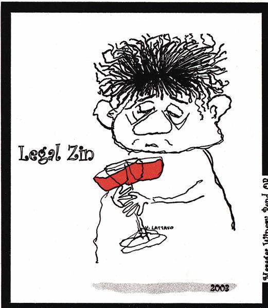
- Maragas WineryThe label's beatnik characters were created by owner Doug Maragas' mother in 1959. Maragas said he wants consumers to see the label and be happy.
Eye-popping colors in bold print portray a seductive blonde striking a Marilyn Monroe-esque pose, a goofy monkey in rock-climbing gear and a muscular rooster wakeboarding on three Cascade Lakes Brewing Co. six-packs.
These playful characters were part of the Redmond-based brewery’s rebranding in 2003, in which President Chris Justema worked to create Crayola-type colors that grab consumers.
”We wanted to convey that we have a young, energetic and fun company making craft beers,” Justema said.
This year, Cascade Lakes will rebrand its packaging and design again – to be released Oct. 1 – spending roughly $12,500 to redevelop the winter seasonal beer’s label, six-pack carton and case box.
The process of creating a unique and memorable brand is critical in Central Oregon’s beer, liquor and wine industry, as local brands compete for consumers against other local businesses in their industry and the larger state and national brands.
Significant time, research and money – sometimes hundreds of thousands of dollars – are put into establishing these brands, and changing the image can run the risk of alienating longtime customers, advertising executives say. But they also can reinvigorate an old standby, which is Cascade Lakes’ aim.
”We feel it gives consumers a chance for us to introduce something new and secondly allows us a chance for a fresh start in the market,” Justema said. ”We can improve on things we’ve done previously – we can reach more of our target audience, which is the Oregon craft-beer drinker.”
At Bend’s Deschutes Brewery, the company’s success and national recognition are closely tied to its simple, earthy and folk-art labels that depict traits specific to Central Oregon, says Paul Evers, president and creative director for tbd advertising, the agency that has helped establish this brand for the past five years.
Deschutes Brewery is the top-selling craft brewery in Oregon, according to the Oregon Brewers Guild. Its Inversion IPA, released in 2006, was the top-selling new craft beer released in the country.
All Deschutes Brewery products reflect aspects of Central Oregon, Evers said – the brewery is named after the Deschutes River, which runs adjacent to the Southwest Simpson Avenue brewery and winds throughout Bend; Black Butte Porter is named after Black Butte, the source of the Metolius River; and the Inversion IPA is named after a weather pattern common in Central Oregon – and one that’s blanketed the region this past week.
”Our main objective has been to continue with the theme of celebrating the natural landscape and landmarks in Central Oregon,” Evers said. ”We’re really trying to capture the essence of (Deschutes Brewery’s) quality approach to hand-crafting beers.”
During Deschutes’ most recent redesign five years ago, tbd advertising collaborated with the brewery’s former designer, Ed Carson of Design of the Times, so the design transition would be smooth and seamless.
Some of the changes included an enlarged bottle-neck label that wraps around the neck, allowing more space to tell the story behind the beer, Evers said.
The artwork, done by North Carolina artist Tim Lee, is meant to convey a handcrafted, contemporary folk-art style, Evers said.
”We wanted it to project a human touch behind the beers,” he said. ”These are people making the beers, not machines.”
All the packaging was designed so the different beers look like members of the Deschutes Brewery family, Evers said.
The design’s natural colors are meant to inspire the natural beauty that surrounds and inspires the products, he added.
”We didn’t want to abandon the brewery’s roots for something trendy,” Evers said. ”We wanted to capture what Deschutes Brewery already had – traditional ales, but progressive – making the best of each beer’s flavor profiles.”
Beyond beer
Following the trend of designs echoing regional landmarks, Bendistillery incorporates names of natural attractions like Crater Lake and the Cascades into its products.
Each product is designed by a different designer, owner Jim Bendis said. So to improve the continuity of his product, Bendis is working on a redesign, hoping to better articulate the products’ natural and high-end qualities.
Bendis started his distillery in Bend 12 years ago, redesigned it four years later and the current redesign is expected to be finished in six months.
Soon, Bendistillery bottles will be thicker and of better quality glass, a cork top will give the bottles a hand-crafted look and the labels will be painted on.
”We’re moving toward that modern, sophisticated look,” Bendis said. ”We want people to know it’s a handcrafted Bendistillery product.”
Volcano Vineyards co-owner Scott Ratcliff had a former family member design his labels in burning orange and lava-rock black. The Bend business grows and makes its wines in the Southern Oregon’s Rogue Valley.
”I always like volcanoes and you read about volcanic soil everywhere here,” Ratcliff said. ”When you think of a volcano, you think of (bold), red wine – but some of the wines we produced at first were lighter, so we added the elegant script to downplay the volcano on the logo.”
Ratcliff and his wife, Liz, opened a tasting room in downtown Bend in June 2006, and the wines are available at a handful of Central Oregon outlets. The couple is working on expanding to more stores and expect their designs to stand out.
Wine stores are saturated with labels depicting family names or critters like frogs, bears and kangaroos, he said.
”With all the labels out there, we hope people will remember the volcano, try the wine, and then associate good wine with the volcano,” Ratcliff said. ”With the volcano, you don’t even need to read the rest of (the label) to know it’s our wine.”
Moving from the branding of Central Oregon landmarks to rich family traditions, Doug Maragas of Bend’s Maragas Winery has designed his labels beatnik-style.
His eight-year-old winery uses funky pen-and-ink characters that Maragas’ mother, Joanne Lattavo, drew in 1959.
”I remember (the drawings) from when I was a kid,” Maragas said. Before Maragas’ mother died of breast cancer in 2002, she had planned on designing more characters for her son’s wine labels. Her illness kept her from producing any more, however, so Maragas went with her former series of beatnik characters.
”I thought that they always made me laugh and I didn’t think there was anything more special than that,” he said. ”For us, in our family, wine was always something that was joyous and made us happy. I wanted something that said this is a joy of life.”
Maragas has received some flak for the designs, he admitted – some in the wine industry thought consumers wouldn’t take the wine seriously because of the beatniks.
Conversely, Maragas says his labels stick in consumers’ minds. In Bend, Maragas Winery bottles are sold at, but not limited to, Ray’s, Wild Oats, Nature’s and Devore’s.
”Once you buy the wine and taste the wine, you’ll understand the connection between what’s in the bottle and what’s on the label,” he said. ”It’s very good wine and if you look at the label and it makes you smile, it’s a very good thing.”
More Business


Best of the Best of Bend 2025

-
-
-